I've written about the random stack of empty notebooks that I own before, none of which were actually purchased by me. A couple of them were Moleskines from my mother's events; there was a Moleskine-alike that has brilliant paper but that probably won't work as a journal because every single page is perforated (why!), and a Leuchtturm 1917.
Since then, I've done some swapping and given some notebooks away. (I can never resist a notebook-junkie friend asking to try something.) I've also come down to the last ten or so pages in the Zequenz I'm currently using as a diary and although I love what I've done with it, I loathe the ridiculously translucent paper. I decided to actively buy several notebooks that I've always wanted to try and have them all side by side so that I can review them and find my favourite once and for all.
I've pared the stash down to five notebooks that all seem to meet most of the criteria I have and
none of the notebooks that I bought are more expensive than a Moleskine in a shop like, say, Popular or Kinokuniya. So.
I'm going to do a general overview before I get to writing in each notebook in turn.
First, a note about
Overjoyed (Facebook here).
If you are a paper geek in any way, shape or form, please, please come here.
It's more an art store than a stationery shop and there are loads of paints, brushes, easels and wood pieces for people looking to do art projects. Makes sense since it's located right next to the Lasalle College of the Arts.
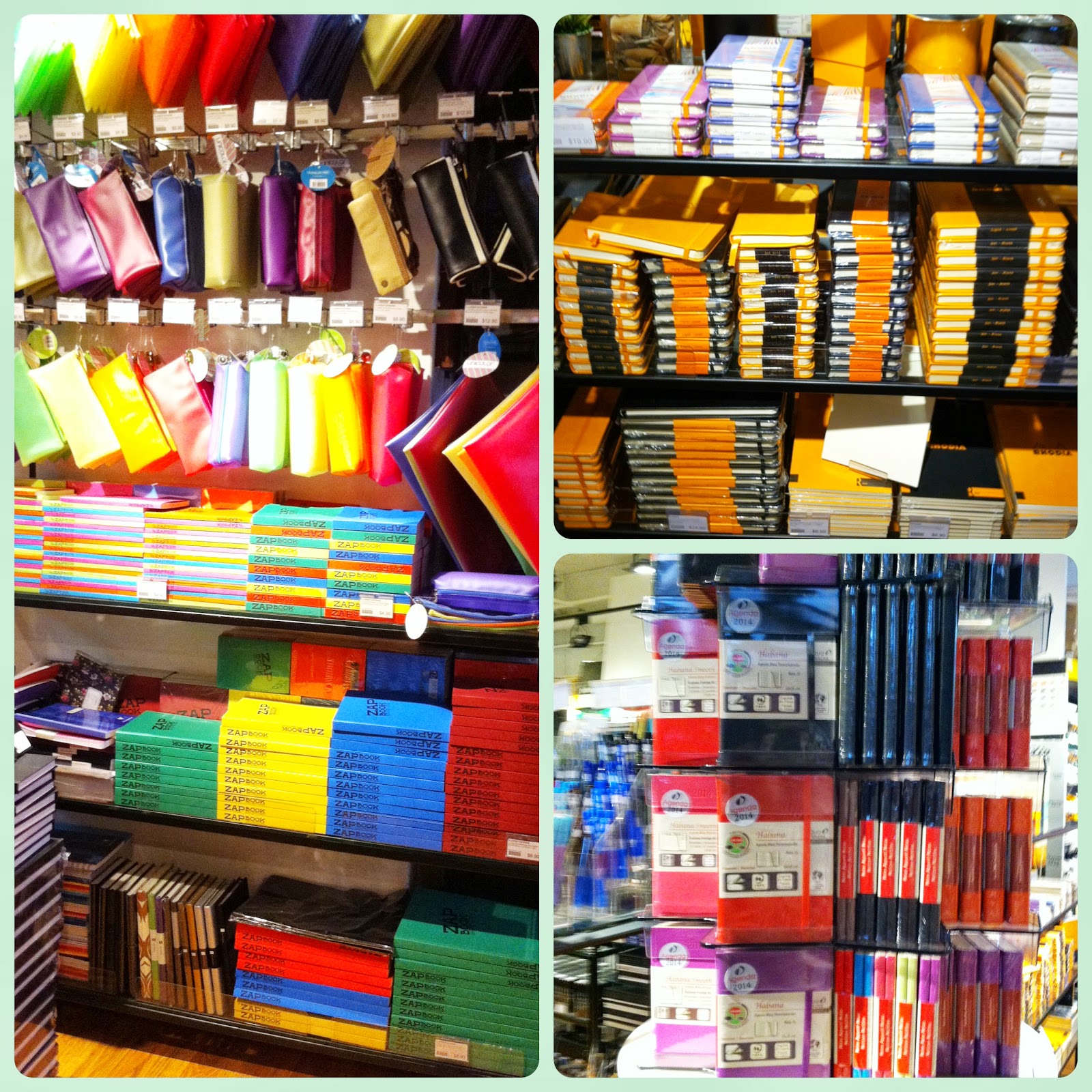
When it comes to notebooks on the other hand, it has a formidable supply. For one, they are the only shop that gets notebooks that come directly from the Clairefontaine supplier in Europe, which means that they carry Rhodia, Quo Vadis and the elusive Clairefontaine itself.
(Sidenote: I'm a little fuzzy on where the company stands right now, but I believe that Exaclair, the parent company for Clairefontaine, currently owns Rhodia and Quo Vadis and as such, there are Rhodia notebooks with Clairefontaine paper in them. The Quo Vadis Habana is supposed to contain the same stuff. It gets confusing when you realise that there are still Rhodias for sale with
Rhodia paper in them (I can't tell if this is just another name for Exaclair paper or an entirely different product), but it's supposed to be very good as well.)

At any rate, the sheer range of paper in Overjoyed is impressive - there is a whole range of Clairefontaine paper that runs from pulpy-looking recycled sheets in the Zapbooks to the smooth as silk 90gsm fountain pen friendly stock it is so famous for and then all the way up to a 120 - 140gsm art block range. I also saw Monologue notebooks and a whole bunch of Strathmore products.
The staff weren't overly friendly at first and eyed me suspiciously as I went around reverently handling things but when I started asking about where they got the paper from and about various bindings, they relaxed and we had a nerdy chat about the stock. They're fairly knowledgeable and very concerned about the display and quality of the products, which is excellent news for notebook lovers.
I decided to get a range of things (a couple were presents) and for myself, I kept two notebooks, both by Clairefontaine and filled with Clairefontaine paper.
My current stash, from top to bottom (all lined):
1) Paperblanks Parabole Ultra Wrap Gutenberg Bible design (way bigger than A5)
2) Clairefontaine A5 Spiral Bound
3) Clairefontaine Jasmyn
4) Leuchtturm 1917
5) Moleskine
(Does it bother you that the band on the Leuchtturm is twisted? I've just noticed it and now it's driving me nuts.)
I gave one Clairefontaine A5 Spiral Bound to my friend JM because I thought she would enjoy the paper and I gave a Rhodia Webnotebook (with Clairefontaine paper) away to my friend David.
A quick word about the stupidly-named Webbie: when I gave it to David, he unwrapped it straightaway and we fell to testing the famous paper. I wrote with a fountain pen on the first page and there was absolutely no showthrough, which means, hurrah for markers! The binding is not perfectly flat but I think it is flat enough and the paper is very pleasing even though drying time is a little longer. For $16.90, I think it is a wonderous alternative to the Mole and will make a perfect regular use notebook.
Here is where the books stand at present, if I'm comparing like with like.
The Clairefontaine Jasmyn is my favourite. I love everything about it from the vivid pattern to the wraparound cover, held in place with two magnets. At $24.90, it is very pricey and I probably wouldn't buy too many of them but given that they are about $15 cheaper than Moles in Singapore and the pure quality of the product, I think you get what you pay for.
This is going to be my next journal and I already see myself loving everything from the lines to the beautiful little touch of the metal tag on the bookmark.
It lies flat with a bit of coaxing and even though the lines don't run all the way to the edge of the page, I don't mind because my words tend to fall off the edge and this will stop them.
This is the other Clairefontaine I bought, a simple A5 spiral bound (in my understanding they're constantly coming out with new cover patterns) and I had to give one to Jia Min to try. The paper is a beautiful smooth 90gsm fountain pen friendly white that feels glossy and cool to the touch and for all that, it costs $6.90. Yes. $6-freaking-90. I could buy a whole stack of these for all kinds of nonsense at the same price that Azone or Ugrade sells them.
To compare the two:
Both books contain the fountain pen friendly 90gsm, but the Jasmyn has the more sophisticated ivory paper and the line distribution is more to my liking. Ultimately though, for the price, I don't think you can discount the spiral bound.
One other good thing about the Jasmyn though, is that the wraparound design means that the book won't flap open and things are less likely to fall out. As a test, I randomly stuffed the book with thick index cards in the photo above and you can see that although the pages buckle a bit, the wraparound cover is built to be able to hold some expansion, which means that you can paste things in it! Perfect journalling material in my opinion.
The next comparison is between the Paperblank and the Jasmyn. I've resisted trying a Paperblank for the longest time because something about the binding and design really throws me. Recently however, I saw a couple of videos about the high quality control of the binding and paper making process and thought that maybe it was time to give one a shot.
You can get these in Kinokuniya which is having a delightful 20 per cent sale till this Sunday (run!).
I'm both unimpressed and pleasantly surprised. First, that the covers are absolutely stunning is undeniable. Some of the books have metal clasps and intricate gilded covers and pages. The Gutenberg Bible design above has the most beautifully notched spine. The binding also suggests that the book will eventually lie acceptably flat, so okay.
This is the most pricey brand that I paid for though (still cheaper than a Moleskine! Argh Moleskine, are you listening?) and while the paper is thick and durable, the line spacing irritates me (not in a scientific way or anything, just gut feel) and it is quite a bit more toothy than Clairefontaine.
(Clairefontaine left, Paperblanks, right)
So maybe again, not something I would purchase on a regular basis, but they will make absolutely delicious presents. I can just see someone receiving one and feeling like they have a beautifully made, vintage-look book to write special things in. Good work, Paperblanks.
Now the final comparison - the ubiquitous, love-hate Moleskine and the Leuchtturm 1917. A disclaimer: I don't think I can truly judge both books until I've used them for extended periods of time in close proximity, but this is a first impression.
Again, I was surprised here. I expected to like the Leuchtturm a lot more. I expected to feel like the Mole was cheap and shitty and that I would never want to look one in the face again, but what can I say? Old habits die hard.
The inside front covers are quite similar but I prefer the Moleskine font and warmer colour.
The Leuchtturm has contents pages! Which I imagine would be quite impressive for some people except that I have no clue what I would do with them.
Here's where the real difference lies for me. Yes, the Moley paper is cheaper and possibly quite crappy. But I don't write with a fountain pen so I'm not sure it will matter. I like the colouring of the Moleskine paper better and contrary to popular opinion, I even like the obtrusive colour of the lines.
I love the fact that the Leuchtturm's 80gsm pages are numbered, but I hate that date thing on the top of the page. Where do you get off telling me where to write the date, huh Leuchtturm? Especially since it's right smack in the middle and I don't write the date on every page? It looks so ugly and it completely throws the alignment of the page off, especially if you like to write left-aligned. And why the random two languages here but three on the contents page?! Why?!
Ahem. On that... impassioned note, I'll leave off here. Ultimately, without having used any of these for a long time, I suspect that my favourite will be the Jasmyn, with the Rhodia possibly coming a close second and the Moleskine acting as a comfortable, old shoes type standard fallback.
I'll probably have a better idea in a few months at which point, I'll do an update. It's all a bit of a muddle right now, but there is one thing I am coming down firmly on the side of, and that is Overjoyed.
My first visit definitely wasn't the last.
______________________
Overjoyed is located at
89 Short Street, Singapore, Singapore 188216
Mon - Fri: 10:00 am - 7:00 pm
Sat: 10:00 am - 2:00 pm
Phone: 6333 9776